Sequential Gaussian Simulation#
SGS is commonly used in mining to create multiple realizations of ore grade distributions, which can be used to assess uncertainty in resource estimates.
import geolime as geo
import numpy as np
from pyproj import CRS
from plotly.subplots import make_subplots
import plotly.graph_objects as go
import seaborn as sns
import matplotlib.pyplot as plt
geo.Project().set_crs(CRS("EPSG:20350"))
geo.Project().set_config(geo.Config.NUM_PROCS, 1)
Read Surface and Drillholes files#
domain_solid = geo.datasets.load("rocklea_dome/domain_mesh.dxf")
domain_solid.name = "channel_hg"
dh = geo.read_file("../data/domained_drillholes.geo")
bm_smu = geo.read_file("../data/block_model_smu.geo")
bm_panel = geo.read_file("../data/block_model_panel.geo")
Estimation#
domain_solid.contains(dh)
dh.set_region_condition("channel_hg", "in_channel_hg and Fe.notna()")
Change of support#
SGS assumes that the data follows a Gaussian distribution. In most cases, the data isn’t Gaussian and needs to be transformed using techniques like the normal score transform. The Anamorphosis GeoLime object will be useful to transform the data to a Gaussian distribution, allowing to perform Variography and Simulations and then easily transform back the simulation results into the original distribution.
geo.histogram_plot([{"object": dh, "property": "Fe", "region":"channel_hg"}])
dh["Fe_gauss"] = "NaN"
anam = geo.Anamorphosis(
data=dh.data("Fe", "channel_hg"),
coefficient_number=30
)
dh.set_property_value(name="Fe_gauss", data=anam.gauss_scores, region="channel_hg")
go.Figure(data=[go.Scatter(x=dh["Fe"], y=dh["Fe_gauss"], mode='markers', line_color="black", marker_size=4, name="Empirical transform")])
geo.histogram_plot([{"object": dh, "property": "Fe_gauss"}])
Variography#
For simulations, the variography here is performed on normal scores. The workflow is the same as for data with a raw distribution.
VarioMap#
lags, tol = geo.generate_lags(lag=200, plag=50, nlags=15)
geo.vario_map(
geo_object=dh,
attribute="Fe_gauss",
region="channel_hg",
lags=lags,
tol=tol,
n_az=15,
atol=35
)
geo.vario_contour(
geo_object=dh,
attribute="Fe_gauss",
region="channel_hg",
lags=lags,
tol=tol,
n_az=15,
atol=35
)

VarioMap suggets major and minor preferential direction are N160 and N70.
major_direction = 160.
minor_direction = 70.
Fitting a Covariance Model#
Model the Nugget Effect#
Experimental Downhole Variogram#
lags_bh, tol_bh = geo.generate_lags(lag=1., plag=50, nlags=10.)
vario_exp_bh = geo.variogram_downhole(
object=dh,
attribute="Fe_gauss",
region="channel_hg",
lags=lags_bh,
tol=tol_bh
)
geo.plot_semivariogram(
variograms=[vario_exp_bh],
display_npairs=True
)
vario_exp_bh
| lag | npairs | avgdist | vario | |
|---|---|---|---|---|
| 0 | 1.0 | 1642.0 | 1.0 | 0.408523 |
| 1 | 2.0 | 1570.0 | 2.0 | 0.671576 |
| 2 | 3.0 | 1497.0 | 3.0 | 0.839095 |
| 3 | 4.0 | 1426.0 | 4.0 | 0.944264 |
| 4 | 5.0 | 1355.0 | 5.0 | 1.010042 |
| 5 | 6.0 | 1285.0 | 6.0 | 1.014835 |
| 6 | 7.0 | 1217.0 | 7.0 | 1.024104 |
| 7 | 8.0 | 1150.0 | 8.0 | 1.017840 |
| 8 | 9.0 | 1083.0 | 9.0 | 1.018911 |
Automatic Fitting#
nugget_model = geo.Nugget() + geo.Spherical()
geo.model_fit(
variograms=[vario_exp_bh],
cov=nugget_model
)
geo.plot_semivariogram(
variograms=[vario_exp_bh],
model=nugget_model,
model_angles=[{"azi":0, "dip":90, "pitch":90}],
display_npairs=True
)
print(nugget_model)
Model with 2 components
Component 1 :
Sill : 0.13714728431401635
Covariance type : Nugget
Component 2 :
Sill : 0.8568929525017024
Covariance type : Spherical
Scales : (8.95853476751526, 2.1099458028644507, 4.636195791699543)
Angles : (357.96212926753594, 4.996464699437222, -45.99074960833414)
Total sill = 0.9940402368157187
nugget_value = nugget_model.cov_elem_list[0].sill
Model the Sphericals#
Experimental Variograms along the XY plane#
lags, tol = geo.generate_lags(lag=50, plag=50, nlags=10)
vario_exp_major = geo.variogram(
object=dh,
attribute="Fe_gauss",
region="channel_hg",
geographic_azimuth=major_direction,
dip=0,
pitch=0,
lags=lags,
tol=tol,
atol=40
)
vario_exp_minor = geo.variogram(
object=dh,
attribute="Fe_gauss",
region="channel_hg",
geographic_azimuth=minor_direction,
dip=0,
pitch=0,
lags=lags,
tol=tol,
atol=30
)
geo.plot_semivariogram(
variograms=[vario_exp_major, vario_exp_minor],
display_npairs=True
)
Automatic Fitting#
model = geo.Nugget() + geo.Spherical() + geo.Spherical()
short_range_spherical_ratio = 0.7
long_range_spherical_ratio = 0.3
geo.model_fit(
variograms=[
vario_exp_major,
vario_exp_minor,
vario_exp_bh
],
cov=model,
constraints=[
{"sill_fixed":nugget_value},
{
"sill_max": short_range_spherical_ratio * (vario_exp_major.attrs["variable_var"] - nugget_value),
"angle_fixed_0": major_direction,
"angle_fixed_1": 0,
"angle_fixed_2": 0,
"scale_expr_1": "scale_0_1"
},
{
"sill_max": long_range_spherical_ratio * (vario_exp_major.attrs["variable_var"] - nugget_value),
"angle_fixed_0": major_direction,
"angle_fixed_1": 0,
"angle_fixed_2": 0,
"scale_expr_1": "scale_0_2"
}
]
)
geo.plot_semivariogram(
variograms=[
vario_exp_major,
vario_exp_minor,
vario_exp_bh
],
model=model,
model_angles=[{"azi":major_direction, "dip":0, "pitch":0}, {"azi":minor_direction, "dip":0, "pitch":0}, {"azi":0, "dip":90, "pitch":90}],
display_npairs=True,
variogram_colors=['green', 'blue', 'orange']
)
print(model)
Model with 3 components
Component 1 :
Sill : 0.13714728431401635
Covariance type : Nugget
Component 2 :
Sill : 0.6017612107223259
Covariance type : Spherical
Scales : (57.067981117894675, 57.067981117894675, 4.1920788393017485)
Angles : (160.0, 0.0, 0.0)
Component 3 :
Sill : 0.2652832805795485
Covariance type : Spherical
Scales : (82.46217021217794, 82.46217021217794, 6.140850681138665)
Angles : (160.0, 0.0, 0.0)
Total sill = 1.0041917756158907
Covariance & Neighborhood settings#
neighborhood = geo.MinMaxPointsNeighborhood(
dimension=3,
metric=geo.Metric(
angles=[0, 0, 0],
scales=[1000, 1000, 30]
),
min_n=1,
max_n=13,
)
estimator = geo.SGS(model, neighborhood)
Sequential Gaussian Simulation#
In resource estimation, between 20 and 50 simulations are generally sufficient to characterize the range of possible grade values.
simulations_number = 20
ore = estimator.solve(
obj=dh,
obj_region="channel_hg",
obj_attribute="Fe_gauss",
support=bm_smu,
support_region="channel_hg",
support_attribute="Fe_SGS_gauss",
simulations_number=simulations_number
)
Simulating grade: 10%|███▍ | ETA: 0:02:35
Simulating grade: 35%|███████████▉ | ETA: 0:01:37
Simulating grade: 60%|████████████████████▍ | ETA: 0:00:58
Simulating grade: 85%|████████████████████████████▉ | ETA: 0:00:21
Simulating grade: 100%|██████████████████████████████████| Time: 0:02:22
ore = estimator.solve(
obj=dh,
obj_region="channel_hg",
obj_attribute="Fe_gauss",
support=bm_panel,
support_region="channel_hg",
support_attribute="Fe_SGS_gauss",
simulations_number=simulations_number
)
Simulating grade: 10%|███▍ | ETA: 0:00:08
Simulating grade: 35%|███████████▉ | ETA: 0:00:06
Simulating grade: 60%|████████████████████▍ | ETA: 0:00:03
Simulating grade: 85%|████████████████████████████▉ | ETA: 0:00:01
Simulating grade: 100%|██████████████████████████████████| Time: 0:00:08
The simulated values are back-transformed to the original variable space if a transformation was applied initially. This step restores the original data distribution
for attrib in bm_smu.properties() :
if "Fe_SGS_gauss" in attrib and ("var" or "mean") not in attrib :
new_attrib = attrib[:6]+attrib[12:]
bm_smu.set_property(name=new_attrib, data=anam.empirical_transform(bm_smu.data(attrib)))
for attrib in bm_panel.properties() :
if "Fe_SGS_gauss" in attrib and ("var" or "mean") not in attrib :
new_attrib = attrib[:6]+attrib[12:]
bm_panel.set_property(name=new_attrib, data=anam.empirical_transform(bm_panel.data(attrib)))
Mean Estimate, also called E-Type, is computed taking the mean value of the simulations for each block. E-Type might be useful to compare results with other estimator such as Kriging.
bm_smu.set_property_expr("Fe_SGS_mean", "nan", region="~channel_hg", default=0)
for prop in bm_smu.properties():
if ((prop[-1]).isdigit() == True) and "SGS" in prop and "gauss" not in prop:
bm_smu.set_property_expr(
"Fe_SGS_mean",
f"Fe_SGS_mean + {prop}",
)
bm_smu.set_property_expr("Fe_SGS_mean", f"Fe_SGS_mean / {simulations_number}")
bm_panel.set_property_expr("Fe_SGS_mean", "nan", region="~channel_hg", default=0)
for prop in bm_panel.properties():
if ((prop[-1]).isdigit() == True) and "SGS" in prop and "gauss" not in prop:
bm_panel.set_property_expr(
"Fe_SGS_mean",
f"Fe_SGS_mean + {prop}",
)
bm_panel.set_property_expr("Fe_SGS_mean", f"Fe_SGS_mean / {simulations_number}")
Other data could also be computed such as variance of result for a specific bloc or the value where a fixed conditional cumulative distribution function (cdf) value p is reached, i.e., the conditional p quantile value.
QA-QC#
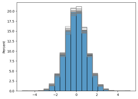
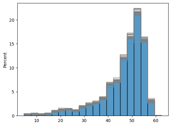
Histograms#
Several QA/QC graphics can be made :
Histograms of Gaussian and Raw Distribution of simulations. Indeed, simulations respect the distribution of input data.
In Blue is shown drillholes data histograms and in grey are shown the histograms of the various simulations.
fig, ax = plt.subplots()
[
sns.histplot(
bm_panel[f"Fe_SGS_gauss_{i}"],
stat='percent',
bins=20,
element="step",
fill=False,
ax=ax,
color='grey',
alpha=0.6
) for i in range(1, simulations_number)
]
sns.histplot(
dh.data("Fe_gauss", "channel_hg"),
stat='percent',
bins=20,
ax=ax,
color='tab:blue'
)
plt.show()
fig, ax = plt.subplots()
[
sns.histplot(
bm_panel[f"Fe_SGS_{i}"],
stat='percent',
bins=20,
element="step",
fill=False,
ax=ax,
color='grey',
alpha=0.6
) for i in range(1, simulations_number)
]
sns.histplot(
dh.data("Fe", "channel_hg"),
stat='percent',
bins=20,
ax=ax,
color='tab:blue'
)
plt.show()
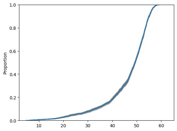
Cumulative Distribution#
Cumulative Distributions can also be shown, which provides another view of simulations uncertainty characterisation.
In Blue is shown drillholes data cumulative distributions and in grey are shown the cumulative distributions of the various simulations.
fig, ax = plt.subplots()
[
sns.ecdfplot(
bm_panel[f"Fe_SGS_{i}"],
ax=ax,
color='grey',
alpha=0.6
) for i in range(1, simulations_number)
]
sns.ecdfplot(
dh.data("Fe", "channel_hg"),
ax=ax,
color='tab:blue'
)
plt.show()
Variography on simulations results#
Simulations realisations also respect variogram model meaning we can compute the experimental variography of the simulations. They should respect original variogram model. Here Gaussian results are used in order to match gaussian variogram model.
lags, tol = geo.generate_lags(lag=50, plag=50, nlags=10)
vario_major_simu = []
for i in range(1, 5):
vario_exp_bm_major = geo.variogram(
object=bm_smu,
attribute=f"Fe_SGS_gauss_{i}",
region="channel_hg",
geographic_azimuth=major_direction,
dip=0,
pitch=0,
lags=lags,
tol=tol,
atol=40
)
vario_major_simu.append(vario_exp_bm_major)
vario_semi_simu = []
for i in range(1, 5):
vario_exp_bm_semi = geo.variogram(
object=bm_smu,
attribute=f"Fe_SGS_gauss_{i}",
region="channel_hg",
geographic_azimuth=minor_direction,
dip=0,
pitch=0,
lags=lags,
tol=tol,
atol=40
)
vario_semi_simu.append(vario_exp_bm_semi)
geo.plot_semivariogram(
variograms=[vario_exp_major] + vario_major_simu,
model=model,
model_angles=[
{"azi":major_direction, "dip":0, "pitch":0},
],
display_npairs=True
)
geo.plot_semivariogram(
variograms=[vario_exp_minor] + vario_semi_simu,
model=model,
model_angles=[
{"azi":minor_direction, "dip":0, "pitch":0},
],
display_npairs=True
)
Simulations in Gaussian space can now be removed as they will not be used anymore.
prop_gauss_name = [prop for prop in bm_panel.user_properties() if 'gauss' in prop]
bm_panel.remove_property(prop_gauss_name)
bm_smu.to_file("../data/block_model_smu")
bm_panel.to_file("../data/block_model_panel")
Probability above cutoff#
The probability of exceeding a cutoff can also be computed. This is done for a single block by computing the number of simulations which exceeds the given cutoff. Here we create two properties wich are the probability for each block to be above 25 and 40% Iron.
Due to support effect, probability and proportion are not equal and some post-processing would be needed.
cutoff = [25, 40]
for value in cutoff :
bm_smu[f"probability_above_{value}"] = "nan"
bm_smu.set_property_value(
name=f"probability_above_{value}",
data=np.sum([bm_smu.data(f'Fe_SGS_{i}', region='channel_hg') > value for i in range(1, simulations_number)], axis=0) / simulations_number,
region='channel_hg'
)
Map of probability can then be plotted.
properties = [f"probability_above_{cutoff[0]}", f"probability_above_{cutoff[1]}"]
fig = make_subplots(
rows=1,
cols=2,
subplot_titles=[f"Probability above {cutoff[0]}", f"Probability above {cutoff[1]}"],
specs=[[{"type": "mapbox"} , {"type": "mapbox"}]]
)
# Add plots
for i in range(2):
obj = bm_smu
prop = properties[i]
trace=geo.plot_2d(
[
{"georef_object": obj, "property": prop, "agg_method": "mean", "region":"channel_hg", "region_agg":"any"},
]
)
fig.add_trace(trace["data"][0],row=1, col=i+1)
mapbox=f"mapbox{i+1}"
fig.update_layout({mapbox:{"zoom":12, "style":'open-street-map', "center":trace["layout"]["mapbox"]["center"]}})
fig.update_traces({"coloraxis":"coloraxis"}, col=i+1)
fig.update_layout({"coloraxis":{"cmin":0,"cmax":1,"showscale":True,"colorscale":"Viridis" ,"colorbar_x":1,"colorbar_yanchor":"middle", "colorbar_y":0.5}})
fig.update_layout(width=750, height=600)
fig.update_layout(margin=dict(l=0, r=0, t=30, b=10))
#Set global colorscale
fig.update_layout(showlegend=False)
fig.show()
Swath Plots#
plot = geo.swath_plot(
[
{
"obj":dh,
"attribute":"Fe_pct",
"region":'channel_hg',
"swath_interval":100,
"axis":"Y_M",
"color": "red",
},
{
"obj":bm_panel,
"attribute":"Fe_SGS_mean",
"region":'channel_hg',
"swath_interval":100,
"axis":"Y",
"color": "black",
}
]
)
titles=[f"Fe_SGS_{i+1}" for i in range(simulations_number)]
# Add plots
trace=geo.swath_plot(
[
{"obj":bm_panel, "attribute":title, "region":'channel_hg', "swath_interval":100, "axis":"Y", "color":"blue"}
for title in titles
]
)
for i in range(len(titles)):
trace['data'][2 * i]['line']['width'] = 0.5
trace['data'][2* i]['line']['color'] = 'grey'
plot.add_traces(trace["data"][:])
plot.show()
plot = geo.swath_plot(
[
{
"obj":dh,
"attribute":"Fe_pct",
"region":'channel_hg',
"swath_interval":100,
"axis":"X_M",
"color": "red",
},
{
"obj":bm_panel,
"attribute":"Fe_SGS_mean",
"region":'channel_hg',
"swath_interval":100,
"axis":"X",
"color": "black",
}
]
)
titles=[f"Fe_SGS_{i+1}" for i in range(simulations_number)]
# Add plots
trace=geo.swath_plot(
[
{"obj":bm_panel, "attribute":title, "region":'channel_hg', "swath_interval":100, "axis":"X", "color":"blue"}
for title in titles
]
)
for i in range(len(titles)):
trace['data'][2 * i]['line']['width'] = 0.5
trace['data'][2* i]['line']['color'] = 'grey'
plot.add_traces(trace["data"][:])
plot.show()
plot = geo.swath_plot(
[
{
"obj":dh,
"attribute":"Fe_pct",
"region":'channel_hg',
"swath_interval":50,
"axis":"Y_M",
"color": "red",
},
{
"obj":bm_smu,
"attribute":"Fe_SGS_mean",
"region":'channel_hg',
"swath_interval":50,
"axis":"Y",
"color": "black",
}
]
)
titles=[f"Fe_SGS_{i+1}" for i in range(simulations_number)]
# Add plots
trace=geo.swath_plot(
[
{"obj":bm_smu, "attribute":title, "region":'channel_hg', "swath_interval":50, "axis":"Y", "color":"blue"}
for title in titles
]
)
for i in range(len(titles)):
trace['data'][2 * i]['line']['width'] = 0.5
trace['data'][2* i]['line']['color'] = 'grey'
plot.add_traces(trace["data"][:])
plot.show()
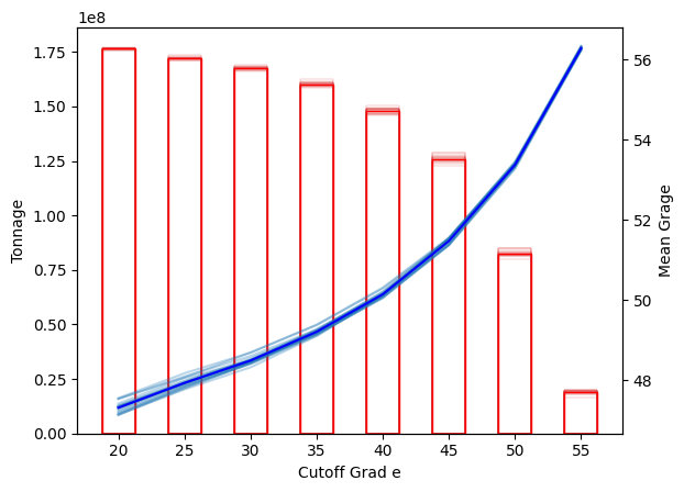
Grade Tonnage Curves#
bm_panel["density"] = 2.4
bm_smu["density"] = 2.4
cutoff_grades=np.arange(20, 60, 5, dtype=int)
GTC can be made for each realisation.
fig = geo.gtc(bm_smu, f'Fe_SGS_1', 'density', cutoff_grades)
fig.update_layout(
yaxis_title="Tonnage",
xaxis_title="Cutoff grade",
yaxis2_title="Mean Grade",
title = "Simulation 1 Grade-Tonnage curve"
)
fig
If we want to capture the uncertaint of the results, we have to extract tonnage and mean grade for each realisation using the compute_selectivity_mean_grade and compute_selectivity_tonnage function.
Using matplotlib to display the tonnage and mean grade is recommended as the interactivity of Plotly becomes slow when we habe this amount of data to display.
mean_grade = [
geo.gtc_plotting.compute_selectivity_mean_grade(grid=bm_panel, attribute=f'Fe_SGS_{i + 1}', density='density', grades=cutoff_grades)
for i in range(simulations_number)
]
tonnage = [
geo.gtc_plotting.compute_selectivity_tonnage(grid=bm_panel, attribute=f'Fe_SGS_{i + 1}', density='density', grades=cutoff_grades)
for i in range(simulations_number)
]
fig, ax = plt.subplots()
ax1 = ax.twinx()
for i in range(simulations_number):
ax1.plot(cutoff_grades, mean_grade[i], color='tab:blue', alpha=0.3)
ax.bar(cutoff_grades, tonnage[i], edgecolor='tab:red', color='None', width=2.5, alpha=0.5, linewidth=0.3)
ax1.plot(cutoff_grades, np.mean(mean_grade, axis=0), color='blue', label='Simulations Mean Grade')
ax.bar(cutoff_grades, np.mean(tonnage, axis=0), edgecolor='red', color='None', label='Simulations Mean Tonnage', width=2.5)
ax.set_xlabel('Cutoff Grad e')
ax1.set_ylabel('Mean Grage')
ax.set_ylabel('Tonnage')
plt.show()